Opting for Cabs, The Hidden Benefit(?) of Construction
New Yorkers spend millions on taxis when subways undergo maintenance on the weekends.
You have several choices when your subway service is disrupted:
- Get those steps in! - walk up to 20 blocks
- Take the bus - wherever that's supposed to happen
- Hail a cab or call an Uber - $$$
- Turn around, go home, fall onto the bed
It's a drag when we're presented with the trade-off framed above. Often, you’re forced to hand over the extra cash and spring for the cab. But if this happens to lots of people, across the city, every week, that’s an economic impact that’s hard to ignore.
Externality is the official term for this sort of impact.
A cost or benefit that affects a party who did not choose to incur that cost or benefit
When you buy a Metrocard, you sign-up for the occasional maintenance necessary to keep the whole system moving. I thought long and hard if the forced alternative modes of transportation created a negative externality (cost) for commuters. I decided no. Maintenance and it’s associated costs are part of the social contract between commuters and the MTA. Side-effects are baked into the relationship.
Cabbies, on the other hand, benefit from the situation and as a third party. They experience a *positive externality* with the extra cash in their pockets, stemming from a phenomena they had no part in shaping.
So how many people defer to option 3, hailing a cab? It’s an important question for policymakers to ask. If the MTA considers the lost ridership revenue, cost of contractors, and future maintenance, shouldn’t they consider the external effects of planned maintenance?
I spent the last six months data-mining, researching, hacking, and FOIA haggling to wrangle construction records and taxi-trip data from the MTA and TLC. The analysis below is the result of some pretty cool engineering and really lucky events, if you want a deeper dive, feel free to check out the “How did I do this below”.
Let’s start with a pair of Saturdays in July, 2013. The 6th and 13th were both sunny, mid-70s, beautiful summer days in Manhattan. Elliot Spitzer resigned on the 6th and the Yankees lost an away game on the 13th. Demand for public transportation was likely identical on both days.
The only difference? Planned maintenance on the 4,5,6 closed local stops on the uptown and downtown tracks between Brooklyn Bridge and 86th St on 7/13/2013.
AKA you were $0L if you lived on Canal and wanted to take the subway to the Met on 81st.
The two heat-maps show stark differences. Taxi pickups on the 13th had greater intensity along the 4,5,6 corridor, especially near main transit hubs at Union Square, Grand Central, and 59th St.
Madison Square Park is a good reference point. The area is bordered by two Local 6 train stations, the 23rd and 28th St stops. Both of those options were closed to everyone attempting to depart the area.
*ZOOM IN AND ENHANCE*
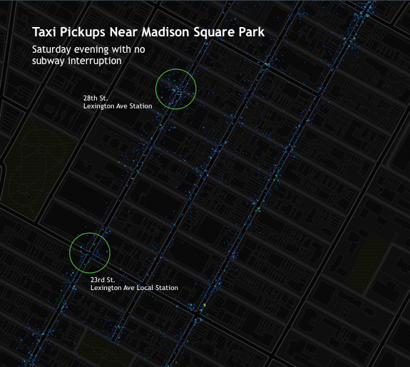
Pick-ups on the 13th are more intense and concentrated within the half-block radius of each station. There’s also heavier traffic on the avenues. It’s possible that folks on Lexington and 3rd, the two vertical stretches to the left of the markers, looked at Google or Embark and realized they were out of luck before walking to the station.
The verdict: more people needed rides on a day with construction as compared to just a week prior when everything was running smoothly.
To dig deeper, let's look at some summary statistics. The chart below shows the per-minute figures for ridership and fare totals. Several tests demonstrated statistically different averages between normal and construction days.
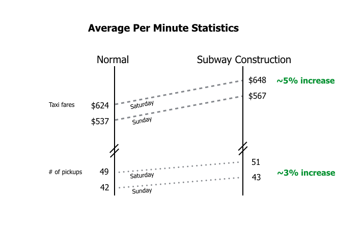
We expect that with more rides, come higher revenue and the data confirms that hypothesis. A side note, however, is that the average fare on a given ride is higher during subway construction. My hypothesis? Folks use the subway for longer treks, and without that option they are forced to pay for an unexpectedly far trip.
The pattern repeats itself on other comparisons and validates the original hypothesis: subway construction affects taxi markets. I examined the last three years of taxi records and split the group on the basis of construction or no-construction. The benchmark -> does the maintenance cause delays that “heavily affect ridership” a standard the MTA used in their file.

Subway construction, on average, does increase taxi-pickups. The gap between the green and red lines is statistically significant. Both curves also have the same shape. General cab-hailing behavior peaks at the expected times. The average revenue just has a higher magnitude when the subways go down.
Construction on the Lexington Line creates demand for about $1.5million in rides every year. We get this number with some 11th grade calculus: calculate the area under each curve and finding the difference for both Saturday and Sunday trends. (Check out the math/formulas below)
City-wide impact hovers around an annual $12million externality for cab drivers. My analysis focused only the Manhattan portion of the 4,5,6 tracks. If we extrapolate the figures and multiply by the other 8 "trunk lines" we see the larger impact unfold.
The MTA invests over $2.5 billion on subway maintenance, repairs, and improvements every year. That's about $300 for every woman, man, and child across the 5 boros. Whether you're paying elevated state and city taxes or forking over cash at the MetroCard kiosk, everyone shares in the burden.
The impact I found, relative to total ridership and capital investment, is miniscule. We're talking basis-points range. But the externality is still real. $400 in extra income for cab drivers, who make on median $33,000/year (and dropping), is a significant boost that wouldn't exist without disruptive subway construction.
Does it matter that cab drivers benefit from subway construction?*YES* Taxi companies like inconvenient public transportation (see: lack of easy access to LaGuardia + JFK.) But the market still isn't efficient. Cab rates stay the same despite higher demand.
That's what firms like Uber are exploiting with surge pricing. Without strong protections to stem private benefits of public transit interruption, commuters are vulnerable to even higher costs when subways go down. And no one bargained for that when they bought their Metrocard.
So how'd ya do it?
A saga working with BigQuery, GEOdata, and FOIA
Want to just dig into the data? Check out the links and scripts below.
I developed a fairly straightforward strategy for this study in a cab-ride to my finance’s place. Yes there was subway construction that day.
- Collect a minute-by-minute level summary of taxi-trips.
- Map daily construction status to the taxi-trip table.
- Run several statistical diagnostics on varialbes using construction status as independent variables.
- Visualize those key statistics over time.
- Calculate the integrals of each curve and then find the differences.
- Ship the results on my own website!
EASIER SAID THAN DONE
Before I get started, I’d be remiss to say that the work above was not possible six months ago. Taxi-trip records were released on an annual basis in separate tables and the MTA didn’t share public records of subway construction. Two fortunate things happened:
- August: The Taxi and Limousine Commission in coordination with NYC’s Open Data initiative worked with Google to host all taxi-trip records on BigQuery (Google’s service for big data analysis).
- Late October:My FOIA request to the city for the dates and extent of construction on the 4,5,6 was fulfilled and they shared a treasure trove of historical records.
1) Collect a minute-by-minute level summary of taxi-trips.
The TLC recently partnered with Google’s BigQuery to create a table of every taxi-trip taken in the past five years. It is a wonder and a long-time coming. Previous releases were limited to a year and one would have to combine and query all of them locally. Today’s solution allows me to query 211MB of data in under 30seconds with complex requests. It is AWESOME. The dataset contains everything from the pick-up and drop-off coordinates to tip-amounts and the type of payment system integrated into the cab.
90% of the query was SQL basics: pull the sum and average of several variables and group for the minute-by-minute summary.
The other 10% - geofencing the trips - was harder than I anticipated. Manhattan doesn’t sit on perfect North-South latitudes/longitudes. The island is actually on a slant, in respect to True North, so using a simple “point-in-the-box” equation doesn’t work for querying broad swaths of land in NYC. In short, you end up getting squares that don’t align to the sector in question.
The path of the 4,5,6 is slanted too, just like the rest of Manhattan. That makes it difficult to triangulate pick-up coordinates and filter whether they sit along the various stations of the Lexington Line. So I had to crack open my old trigonometry textbook and find a generalized approach.
I picked four points at the northern and southern end of Manhattan. The resulting rectangle provided a stretch of the city with a standard deviation of a block from the subway entrances in question. With those coordinates I created an equation that would take any given pick-up location and test whether the distance between that point and each four corners is greater than the sum of each side of the rectangle. Some online examples of this are here, here, and here.
After testing this formula several times placed the code into the full query and pulled the trigger. Step one done.
2) Map daily construction status to the taxi-trip table.
The MTA posts data every minute, but finding historical and aggregated information is difficult. You’d think this is a distribution-with-the-public-problem, but the MTA didn’t have a central store of historical construction data. “We found someone in finance who tracks this for his work, here’s his file.” They were gracious working with me to obtain the file, but it wasn’t plug-and-play.
There’s a famous quote that 90% of “data science” is just getting your information into a format friendly for processing. That was certainly the case here. The FOIA file that the MTA shared with me was a trainwreck (pun-intended).
Every month going back to 2010 had its own tab and days with construction were marked not by character or digit — but rather color-coded. So I had to hand-code a binary 1-or-0 for the appropriate status of subway construction for each day between 2012 and 2015. The Google-spreadsheet I’ve shared below contains that mapping and further explanation.
3) Run several statistical diagnostics on varialbes using construction status as independent variables.
Before digging into higher modeling and visualization I wanted to make sure that I had the statistical grounding to move forward and demonstrate differences.
This is pretty boring. If you’ve read this far, just dive into the R script below where I’ve got several box-plots that find statistically significant differences between both # of rides and revenues between days with/without subway construction.
4) Visualize those key statistics over time.
The ggplot2 package for R is always great. I found a beautiful theme function that I’ve posted on my Github. It allows you to format your entire plot and avoid messy plotting scripts by calling the function instead of incorporating those arguments into the command.
5) Calculate the integrals of each curve and then find the differences.
This was fun! An R package called Bolstad2 contains the necessary integrating functions to calculate the same curve as the geom_smooth writes for the plot. By subtracting the specific integrals for each day’s summary curve we get the difference figure.
6) Ship the results on my own website!
I’ll spare you the details of my personal development in HTML and CSS prowess and jump right into the fun stuff: graphs and images!
CartoDB was a pretty great place to throw data into their application and get sharp, reliable, scalable graphs on the other side. They have made significant improvement in their product over the past year. Importing data is a breeze and they have great options for embedding and deployment. They’ve even managed to perform some iframe witchcraft that prevents the user from accidentally zooming into the map as they scroll. Thumbs up team!
On another note, I tried to use JuxtaposeJS for a “before-and-after” slider. Their embed option is really finicky and wrangling the object’s size is a pain in the @$$ so I gave up and replaced that idea with the gif. Same idea, but the slider would have been cool.
Lastly, moving images from R plots into websites is a pain. An easy remedy is *not* to listen to bloggers talking about using hi-res PNGs and just opting to get the SVG file, throwing that straight into your directory and rendering on the browser. The image looks better and it’s automatically responsive.
Downloads+Links
Google BigQuery Yellow-Cab Tables (Run query below and download the CSV)
MTA Construction Data via FOIA response
Hand-coded MTA Construction Data for the 4,5,6
BigQuery Language
SELECT

	avg(total_amount) as avgcost,
	sum(total_amount) as sumcost,
	avg(passenger_count) as avgpassengers,
	sum(passenger_count) as sumpassengers,
	count(vendor_id) as rides,
	left(time(pickup_datetime), 5) as timer,
	hour(pickup_datetime) as hourr,
	date(pickup_datetime) as dayy

FROM [nyc-tlc:yellow.trips]

WHERE

	(SQRT(((-73.9493608 - pickup_longitude)*(-73.9493608 - pickup_longitude) + (40.7909394 - pickup_latitude)*(40.7909394 - pickup_latitude))) + SQRT(((-73.9460564 - pickup_longitude)*(-73.9460564 - pickup_longitude) + (40.7896073 - pickup_latitude)*(40.7896073 - pickup_latitude))) + SQRT(((-74.0172958 - pickup_longitude)*(-74.0172958 - pickup_longitude) + (40.6918326 - pickup_latitude)*(40.6918326 - pickup_latitude))) + SQRT(((-74.0207291 - pickup_longitude)*(-74.0207291 - pickup_longitude) + (40.6936548 - pickup_latitude)*(40.6936548 - pickup_latitude)))) < 0.2419078579274

AND

	year(pickup_datetime)>2009

	GROUP BY dayy, timer, hourr

	ORDER BY dayy, timer, hourr

	LIMIT 50000000
R Scripts
library("curl")
library("scales")
library("sqldf")
library("ggplot2")
library("jsonlite")
library("dplyr")
library("plyr")
library("scales")
library("tidyr")
library("dplyr")
library("mgcv")
library("magrittr")
library("ROCR")
library("grid")
library("extrafont")
library("Cairo")

####################################################
### Google BigQuery Results
taxicosts <- read.csv("/Users/michaelcata/Documents/NYC_GIT/Taxi/fulltaxidata.csv",
                  header = TRUE, stringsAsFactors = FALSE)

### Cleaning
taxicosts$dayy <- as.Date(taxicosts$dayy)
#taxicosts$timer <- strptime(taxicosts$timer, "%H:%M")
##taxicosts$timer <- as.POSIXct(taxicosts$timer)
taxicosts$dayofweek <- weekdays(taxicosts$dayy)
taxicosts$dayofweek <- factor(taxicosts$dayofweek,
                              levels = c("Monday","Tuesday","Wednesday","Thursday","Friday","Saturday","Sunday"))

### Construction Data
csched <- read.csv("/Users/michaelcata/Documents/NYC_GIT/Taxi/subwayconstruction3.csv", header = TRUE, stringsAsFactors = FALSE)

### Cleaning
csched$cdate <- as.Date(csched$cdate)
csched$LexAll <- factor(csched$LexAll)
csched$LexRed <- factor(csched$LexRed)
csched$AllRed <- factor(csched$AllRed)

combined <- sqldf("select * from taxicosts join csched on dayy = cdate")
combined$LexAll <- factor(combined$LexAll)
combined$LexRed <- factor(combined$LexRed)
combined$AllRed <- factor(combined$AllRed)
combined$dayy <- as.Date(combined$dayy)
combined$dayofweek <- weekdays(combined$dayy)
combined$dayofweek <- factor(combined$dayofweek,
                             levels = c("Monday","Tuesday","Wednesday","Thursday","Friday","Saturday","Sunday"))
combined$timerr <- as.factor(combined$timer)
combined$timerrr <- as.numeric(combined$timerr)


#### construction status specific tables
combinedn <- sqldf("select * from combined where LexAll = 0")
combinedc <- sqldf("select * from combined where LexAll = 1")

#### running the integrals for each day
intcm <- sqldf("select * from combinedc where dayofweek = 'Monday'")
intnm <- sqldf("select * from combinedc where dayofweek = 'Monday'")
intcsat <- sqldf("select * from combinedc where dayofweek = 'Saturday'")
intnsat <- sqldf("select * from combinedn where dayofweek = 'Saturday'")
intcsun <- sqldf("select * from combinedc where dayofweek = 'Sunday'")
intnsun <- sqldf("select * from combinedn where dayofweek = 'Sunday'")

mondaydiff <- sintegral(intcm$timerrr, intcm$sumcost)$int - sintegral(intnm$timerrr, intnm$sumcost)$int
saturdaydiff <- sintegral(intcsat$timerrr, intcsat$sumcost)$int - sintegral(intnsat$timerrr, intnsat$sumcost)$int
sundaydiff <- sintegral(intcsun$timerrr, intcsun$sumcost)$int - sintegral(intnsun$timerrr, intnsun$sumcost)$int

#### Subset days
subday <- sqldf("select * from combined where (cdatee = '2013-07-06' OR cdatee = '2013-07-13') AND hourr between 17 AND 21")
subday <- sqldf("select * from combined where (cdatee = '2013-07-06' OR cdatee = '2013-07-13')")
ggplot(data = subday, aes(timer, y=sumcost,group=dayy,color=factor(dayy)))+geom_smooth()

### timeline
ggplot(data = subset(combined, dayofweek %in% c("Saturday","Sunday")), aes(timerr, y=sumcost,group=LexAll,color=factor(LexAll))) + geom_smooth(fill = "red", alpha = .025) +
		  facet_grid(~dayofweek)+labs(x='Time of Day',y="Average Taxi Revenue Per Minute") +
		  scale_color_manual("Subway Status",  values = c("green", "red"),labels=c("Construction", "Normal"), breaks = rev(levels(combined$LexAll))) +
		  scale_x_discrete(breaks = c("00:00", "02:00", "04:00", "06:00", "08:00", "10:00", "12:00", "14:00", "16:00", "18:00", "20:00", "22:00")) +
		  theme_bw() +
		  theme(text=element_text(family="Microsoft Sans Serif"), panel.grid.major.x = element_line(color = "gray"), panel.grid.major.y = element_line(color = "black"),  panel.margin = unit(1,"lines"), axis.title.y=element_text(vjust=1.5), axis.title.x=element_text(vjust=.1), plot.title = element_text(lineheight=.8, face="bold", hjust = .01, vjust = 1.5)) +
		  scale_y_continuous(labels = dollar)+ ggtitle("Minute-by-minute Taxi Revenue\n4,5,6 Corridor in Manhattan")


## timeline for union square snapshot day
ggplot(data = subday, aes(timerr, y=sumcost,group=dayy,color=factor(dayy)))+geom_smooth(fill = "red", alpha = .05)+labs(x='Time of Day',y="Average Taxi Revenue Per Minute") + scale_color_manual("Subway Status",  values = c("green", "red"),labels=c("Construction", "Normal"), breaks = rev(levels(subday$dayy))) + scale_x_discrete(breaks = c("00:00", "02:00", "04:00", "06:00", "08:00", "10:00", "12:00", "14:00", "16:00", "18:00", "20:00", "22:00"))


### rides boxplots
ggplot(data = subset(combined, dayofweek %in% c("Saturday","Sunday")), aes(factor(LexAll), 	y=rides,group=LexAll,color=factor(LexAll))) +
		   geom_boxplot(outlier.colour = "gray", alpha = .01) +
		   facet_grid(~dayofweek) +
		   stat_summary(fun.y=median, geom="line", aes(group=1)) +
		   scale_color_manual("Subway Status",  values = c("seagreen3", "indianred4"),labels=c("Construction", "Normal"), breaks = rev(levels(combined$LexAll))) +
		   theme_bw() +
		   theme(text=element_text(family="Microsoft Sans Serif"),  panel.margin = unit(1,"lines"), axis.title.y=element_text(vjust=1.5), axis.title.x=element_text(vjust=.1), plot.title = element_text(lineheight=.8, face="bold", hjust = .01, vjust = 1.5), axis.ticks.x = element_blank(), axis.text.x = element_blank(), legend.position = "bottom" ) +
		   labs(x='',y="") +
		   ylim(0, 120) +
		   scale_fill_discrete(guide = guide_legend(reverse=TRUE)) +
		   ggtitle("Average Pickups Per Minute")


### sumcost boxplots
ggplot(data = subset(combined, dayofweek %in% c("Saturday","Sunday")), aes(factor(LexAll), y=sumcost, group=LexAll, color=factor(LexAll))) +
		   geom_boxplot(outlier.colour = "gray", alpha = .01) +
		   facet_grid(~dayofweek) +
		   stat_summary(fun.y=median, geom="line", aes(group=1), "indianred3") +
		   scale_color_manual("Subway Status",  values = c("seagreen3", "indianred4"),labels=c("Construction", "Normal"), breaks = rev(levels(combined$LexAll))) +
		   theme_bw() +
		   theme(text=element_text(family="Microsoft Sans Serif"),  panel.margin = unit(1,"lines"), axis.title.y=element_text(vjust=1.5), axis.title.x=element_text(vjust=.1), plot.title = element_text(lineheight=.8, face="bold", hjust = .01, vjust = 1.5), axis.ticks.x = element_blank(), axis.text.x = element_blank(), legend.position = "bottom" ) +
		   labs(x='',y="") +
		   scale_fill_discrete(guide = guide_legend(reverse=TRUE)) +
		   ggtitle("Average Revenue Per Minute") +
		   ylim(0, 1750)


### stat plots aka proof
p <- ggplot(combined, aes(x=rides))
pu <- ddply(combined, "LexAll", summarise, grp.mean=mean(rides))
ridesdensityplot <- p + geom_density(aes(color = factor(LexAll))) + xlim(0,150) + geom_vline(data = pu, aes(xintercept=grp.mean, color = LexAll), linetype="dashed")

m <- ggplot(combined, aes(x=sumcost))
mu <- ddply(combined, "LexAll", summarise, grp.mean=mean(sumcost))
costdensityplot <- m + geom_density(aes(color = factor(LexAll))) + xlim(0,1750) + geom_vline(data = mu, aes(xintercept=grp.mean, color = LexAll), linetype="dashed")

# density plots
costcdensityplot <- m + stat_ecdf(aes(color = factor(LexAll))) + xlim(0,1750) + geom_vline(data = mu, aes(xintercept=grp.mean, color = LexAll), linetype="dashed")
ridescdensityplot <- p + stat_ecdf(aes(color = factor(LexAll))) + xlim(0,175) + geom_vline(data = pu, aes xintercept=grp.mean, color = LexAll), linetype="dashed")

##########################################################
Get in touch!
I tried to cram every morsel of insight into this piece of work, but there's a lot missing I'm sure. If you're interested in learning more about this project please don't hesitate to reach out.
Reach me at michael@michaelcata.com